Mind the Gap Real Estate
Ethical real estate investing that changes lives and communities.
Challenge:
Mind the Gap (MTG) Real Estate exists to restore stability—both financially and emotionally—for homeowners in distress and financial organizations managing foreclosed properties. When Lindsey, MTG’s founder, reached out, she already had a strong vision for the brand. She knew the heart behind the name, the type of people she wanted to help, and the tone she hoped to strike: calm, trustworthy, and grounded.
She just needed a creative partner to help her bring it all to life.
The Approach:
From the start, this project was deeply collaborative. Lindsey and I worked closely to shape the visual identity and digital presence of Mind the Gap from the ground up. We stayed in constant conversation (sharing ideas, giving feedback, refining language and layout) until everything felt aligned. We knew from the beginning that the goal wasn’t perfection, but clarity and connection.
Services:
Creative direction
Brand identity design
Logo creation
Website design & buildout
Branding with Intention
COLOR PALETTE
During our initial conversations, Lindsey shared the inspiration behind the name “Mind the Gap”—a phrase she remembered from riding the trains in London, cautioning passengers to step carefully. That sense of guidance and awareness became the foundation for the brand’s visual identity.
She envisioned something calm and neutral that would reflect her integrity and compassion. From there, we crafted a soft, earthy palette that grounded the brand and gave it a warm, welcoming feel.
FINAL LOGO
LOGO DESIGN
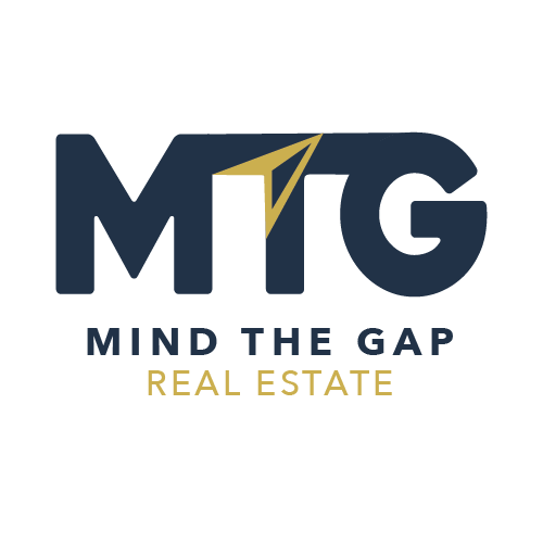
The client’s main request was to include a compass, a symbol that reflected the brand’s role in helping people navigate through difficult circumstances. I created three distinct concepts in Adobe Illustrator, each expressing this idea in a different way.
They were drawn to one in particular but suggested the idea of integrating the compass arrow into the letter “T” for a more seamless connection. That small change made a big impact, and together we finalized a logo that represents direction, trust, and support.
Website Design
Planning the Experience
Building the Site
With the brand direction in place, we moved on to the website. I created wireframes in Figma to plan the layout and flow across desktop, tablet, and mobile, using real content and sample imagery to bring the vision to life early on. The goal was to speak directly to both homeowners and institutional partners—clearly and compassionately.
The client provided thoughtful feedback throughout the process, and we refined the structure and messaging together to make sure it reflected the heart of the business.
We used a WordPress theme included in their hosting plan, which presented some limitations—but also offered a helpful starting point. I used the native builder to construct each page, customizing sections, refining spacing, and finding creative ways to address the theme’s mobile responsiveness issues.
As the design came together, we continued to iterate—reworking sections, simplifying content, and making sure every detail felt intentional. I focused on creating a clean, approachable user experience that made it easy for visitors to understand MTG’s services and take action.
The Outcome
The result is a warm, professional website that brings the Mind the Gap mission to life. It clearly communicates who they help, what they offer, and why it matters—all while creating a sense of trust and support. It also gives the client a flexible content management system that they can update as their business evolves.
Since launch, we’ve continued to build upon the foundation—exploring new features, making ongoing edits, and adjusting as the brand grows. No design is ever final, and this project is a great example of how collaboration, thoughtful iteration, and shared purpose can shape something meaningful over time.
Live Site → mtgrealestate.com

Next Steps:
With the foundation in place, the work is far from over—and that’s the exciting part. The site was built with growth in mind, and we’re continuing to build on it together as the business evolves.
Some of the things we’re exploring next include:
Adding more content that speaks to the questions and concerns homeowners are actually facing
Incorporating brand photography to bring more warmth and personality to the site
Making refinements based on feedback and how people are using the site
Continuing to shape the site so it grows alongside the brand, not behind it
This project has always been a collaboration built on shared values, lots of check-ins, and an openness to keep improving. No design is ever final, and I’m grateful to still be part of the journey as Mind the Gap continues to grow.


